
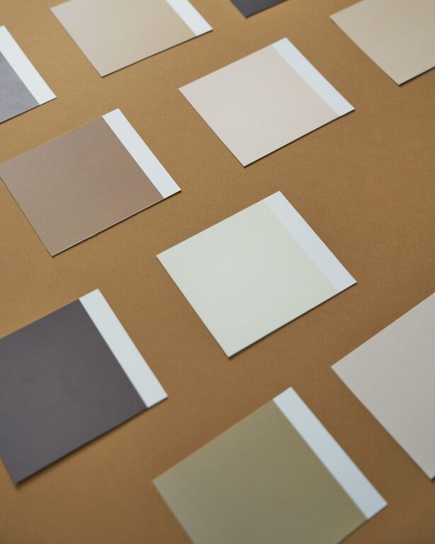
Choosing calm colors for your home can make each room feel more comfortable, balanced, and inviting. Soft shades often help create a relaxed atmosphere, but calm does not have to mean plain or boring. The right color palette can add personality while keeping the space easy on the eyes.
From gentle neutrals to muted blues and greens, many colors can support a peaceful look. The key is to consider how colors work with your lighting, furniture, room size, and daily routine. Use these practical tips to create a home that feels both restful and personal.
Start With the Feeling You Want
Before choosing paint or accessories, think about how you want the room to feel. A bedroom may benefit from colors that encourage rest, while a living room may need a softer, more welcoming mood. A home office could feel calm and focused without looking dull.
Consider words that describe your ideal space:
– Relaxed
– Warm
– Airy
– Grounded
– Comfortable
– Fresh
– Simple
– Cozy
These words can guide your color choices. For example, soft blue may suit an airy and restful room, while warm beige may create a grounded and welcoming feeling. If you want a space to feel fresh, consider pale green, soft white, or a light gray with warm undertones.
Choose a Simple Color Palette
A calm room often has a limited color palette. Using too many unrelated colors can make a space feel busy, even when each shade is attractive on its own.
A simple approach is the 60-30-10 rule:
– Use one main color for about 60 percent of the room.
– Add a supporting color for about 30 percent.
– Use an accent color for the remaining 10 percent.
The main color might appear on walls, rugs, or large furniture. The supporting color can come from curtains, bedding, or chairs. Accent colors work well in smaller details, such as pillows, artwork, vases, or lamps.
This guideline is flexible rather than strict. It simply helps distribute color so that no single shade feels overwhelming.
Explore Soft Neutrals
Neutral colors are a popular choice for calm interiors because they create a quiet background for furniture and personal items. White, cream, beige, taupe, gray, and greige can all work well.
However, not every neutral has the same effect. Bright white may feel crisp and clean, while warm white may feel softer. Cool gray can create a modern appearance, but warm gray may feel more comfortable in rooms with natural materials.
When choosing a neutral, look at the colors already in your home. A beige with yellow undertones may not work well beside cool blue-gray furniture. Try to identify whether your existing pieces are mostly warm, cool, or balanced.
Add Depth With Layered Neutrals
A room made entirely of one neutral can look flat. Add interest by using several related shades. For example, combine:
– Cream walls
– Light beige upholstery
– Medium taupe pillows
– Natural wood furniture
– Soft gray accessories
Varying textures is also helpful. Linen, cotton, wool, wood, woven fibers, and ceramic surfaces can make a neutral palette feel rich without adding strong color.
Consider Muted Blues and Greens
Soft blue and green shades are often associated with nature, open skies, and water. Muted versions can bring color into a room while maintaining a peaceful appearance.
Pale blue works well in bedrooms, bathrooms, and reading areas. Dusty blue or blue-gray can add more depth to a living room or hallway. Soft sage, olive, and eucalyptus green can create a natural feeling without becoming too bright.
If you are unsure about using color on all four walls, try a smaller area first. A muted shade can work well on one wall, inside a bookcase, or in a powder room. You can also introduce the color through curtains, cushions, artwork, or plants.
Pay Attention to Natural Light
Light changes the way a color looks throughout the day. A shade that appears soft in a store may look brighter, darker, warmer, or cooler in your home.
Rooms with strong southern or western light may make colors appear more intense. Soft, warm shades can help balance that brightness. Rooms with limited natural light may benefit from warm whites, pale beige, or gentle blush tones that keep the space from feeling cold.
North-facing rooms often receive cooler light, so warm undertones may create a more comfortable result. East-facing rooms can look brighter in the morning and softer later in the day, while west-facing rooms may become warmer in the afternoon.
Test Before Making a Final Choice
Always test paint colors in the room where they will be used. Paint a large sample on a piece of board or directly on several wall sections. Look at it in the morning, afternoon, and evening.
Keep the sample near flooring, furniture, trim, and window coverings. This helps you see how the color interacts with the rest of the room. If possible, live with the sample for a few days before deciding.
Use Warm and Cool Colors Together Carefully
Warm colors include shades with red, yellow, or orange undertones. Cool colors tend to include blue, green, or purple undertones. Either group can create a calm room, but mixing them requires balance.
For example, a cool gray wall may feel more welcoming with warm wood furniture and cream textiles. A warm beige room may benefit from soft blue accessories for contrast. The goal is not to avoid contrast but to use it gently.
Choose one dominant temperature and use the other for small accents. This creates variety without making the room feel disconnected.
Think About Room Size and Flow
Color can influence how large or small a room appears. Light colors often make a small room feel more open, while medium and dark shades can make a large room feel cozier.
If several rooms are visible from one another, choose colors that relate to each other. They do not need to match exactly. Instead, use a shared undertone or repeat one accent color throughout the home.
For example, a home might use warm white in the main living area, pale sage in the dining room, and soft beige in the hallway. Similar undertones can help the spaces feel connected.
Add Calm Color Through Accessories
You do not have to repaint your walls to create a more peaceful color scheme. Accessories offer an easy way to experiment and update a room.
Try adding:
– Soft cushions and throws
– Neutral area rugs
– Light-colored curtains
– Ceramic vases
– Framed artwork
– Table lamps with fabric shades
– Natural baskets
– Bedding in muted colors
Start with a few items rather than changing everything at once. This allows you to see which combinations feel right and prevents unnecessary clutter.
Keep Your Personal Style in Mind
Calm colors should support your lifestyle and preferences. If you love bright colors, you do not need to remove them completely. Use vivid shades in small, intentional details against a softer background.
A calm home is not defined by a single color family. It comes from balance, thoughtful placement, and a comfortable relationship between the colors in the room. Choose shades that make you feel at ease, then build around them with textures, lighting, and meaningful objects.
By testing colors carefully, considering the light, and keeping the palette simple, you can create rooms that feel peaceful without losing warmth or character.
